BRIEF // Create a classic, strong monochromic logo for 'Moth City' reminiscent of the Art Deco period and the 1930s. Should have militaristic, masculine undertones. Potential visual cues include moths, buildings and the letter 'M'.
It should work as a logo symbol and as a logotype.
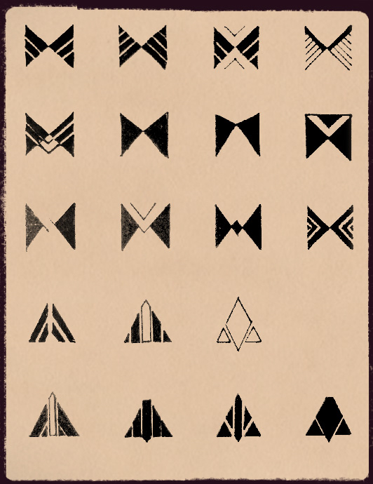
Early trials looked at lots of angular shapes and dividing geometry into smaller components with negative space. Moth wings and silhouettes prevalent.
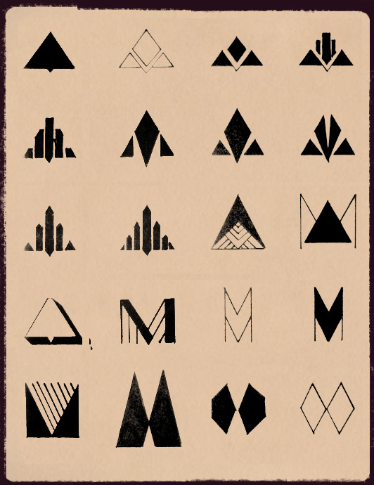
Proceeded with more triangle shapes, and began experimenting with the letter form 'M' and contrasting thick and thin lines.
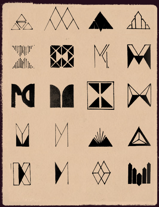
Attempts to divide the space up, use patterns and mirroring designs, still very focused on the form of wings and the letter 'M'.
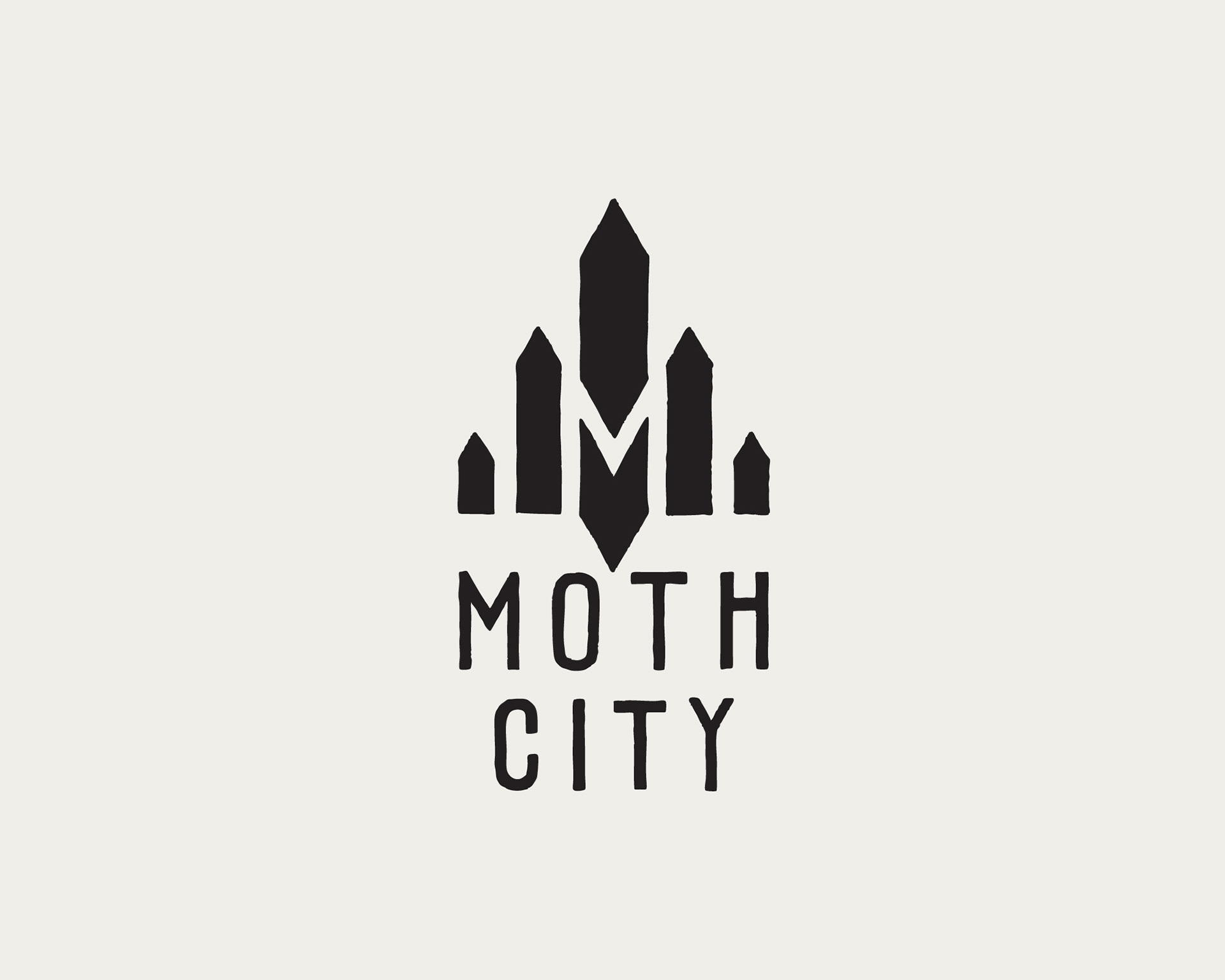
The final logo. Care was taken to hand draw the shapes and lettering at a large size and create a path-based logo with those natural inconsistencies.

Early experimentations with animation that led into the motion graphics trailer. You can see the full animation here.