BRIEF // A short teaser trailer for 'Moth City' that combine all the genre, period and thematic notes into a tight and enticing package. The trailer needed to make use of some existing comic artwork and also have custome illustrations. Graphic elements and animation style needed to be both reactions to the existing Moth City graphic design, but also refective of the period, and genres.
Cues were taken from old Shaw Bros. titles, Noir titles from the states and the film and animation technologies of the 1950s through to the 1970s.
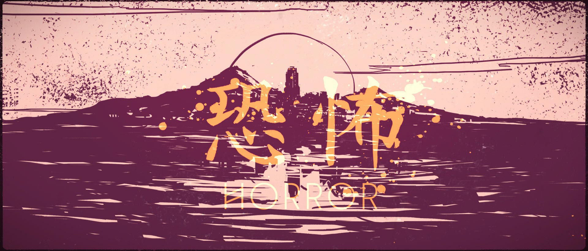
Moth City is a comic that has mystery, horror and pulp fiction in its bones. On one hand a thrilling story of corruption and control during the Chinese civil war, on the other a genre mash of kung fu and detective fiction.
Inspiration was taken from old Kung-Fu movie and trailer intro, by producers like the Shaw Brothers.
Reflecting both the logo and the hero typeface, angled lines and triangles are used to move us through the video, and will be a thematic touch that crosses into new work.
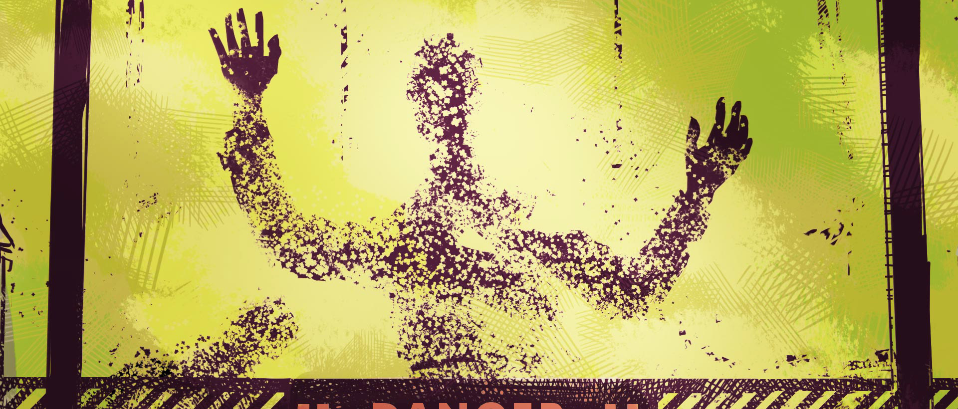

The trailer briefly shows us some artwork from the comic itself.
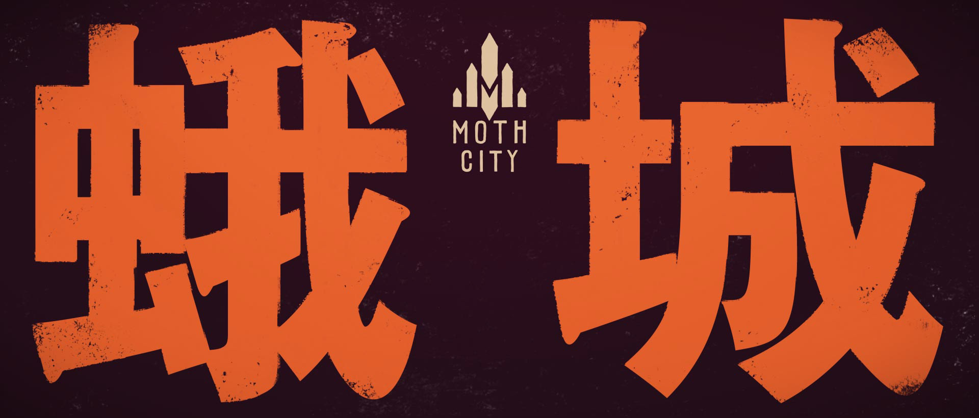

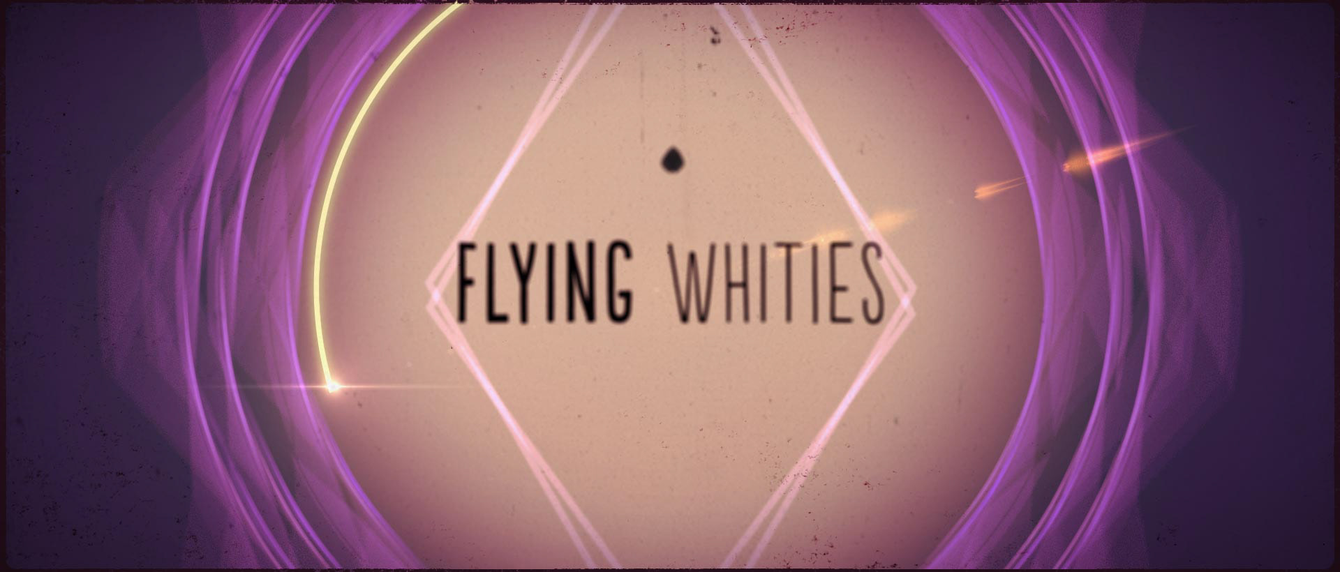
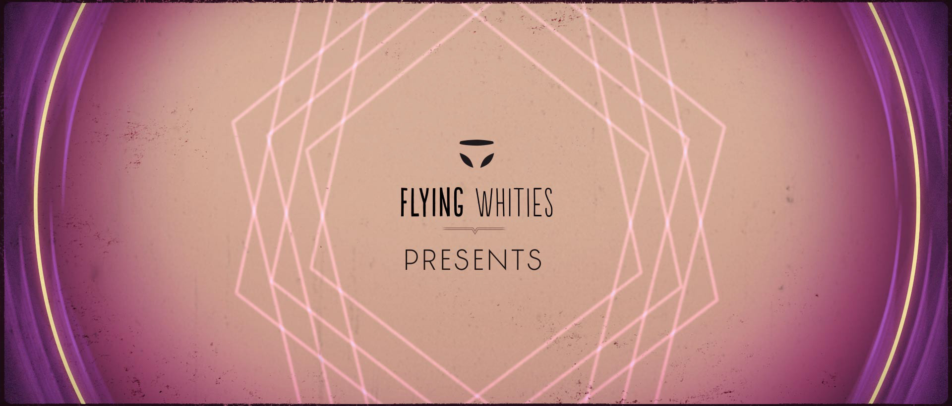
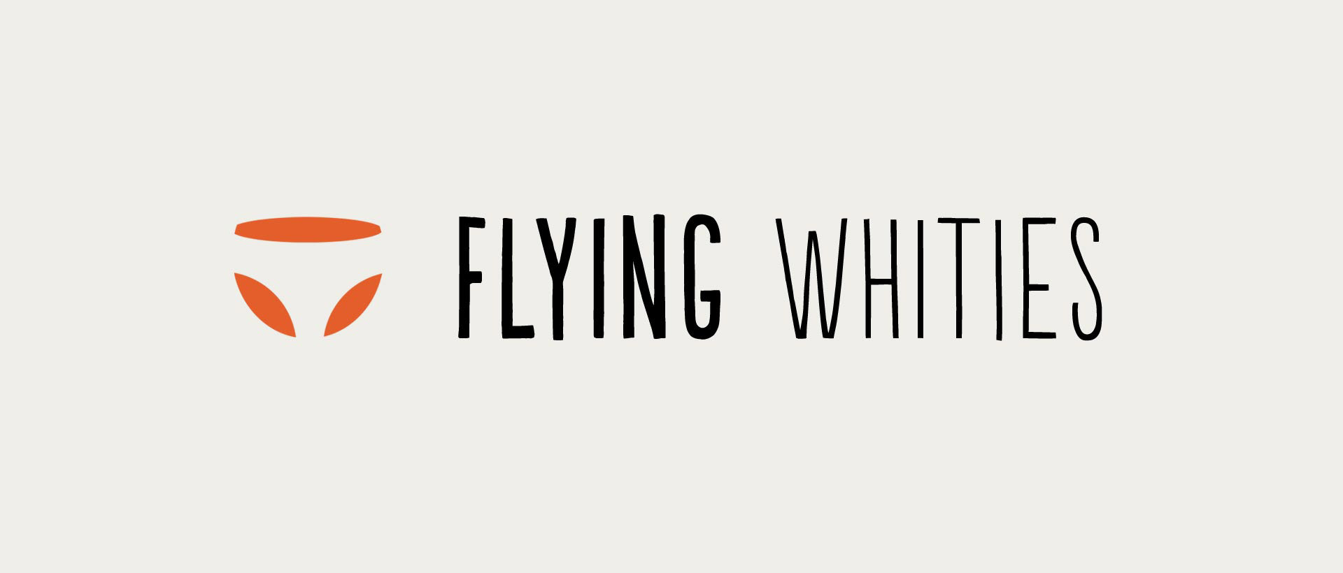
The project involved a lot of graphic design, as opposed to video, and showcased both the Moth City and the Flying Whities branding. You can see the development of the Moth City logo in this extended project.

A lot of time was spent finding the right typeface, that fitted the retro-deco-modern mash up. The font TJ Evolette A was chosen for its combination of classic plain styling, and alternative forms with geometric and deco elements.
It was created by Timo Titzmann & Jakob Runge.
A sample of the font TJ Evolette A. After Effects didn't want to use the alternative letters, as seen here so there were a lot of work-arounds to get them animated.
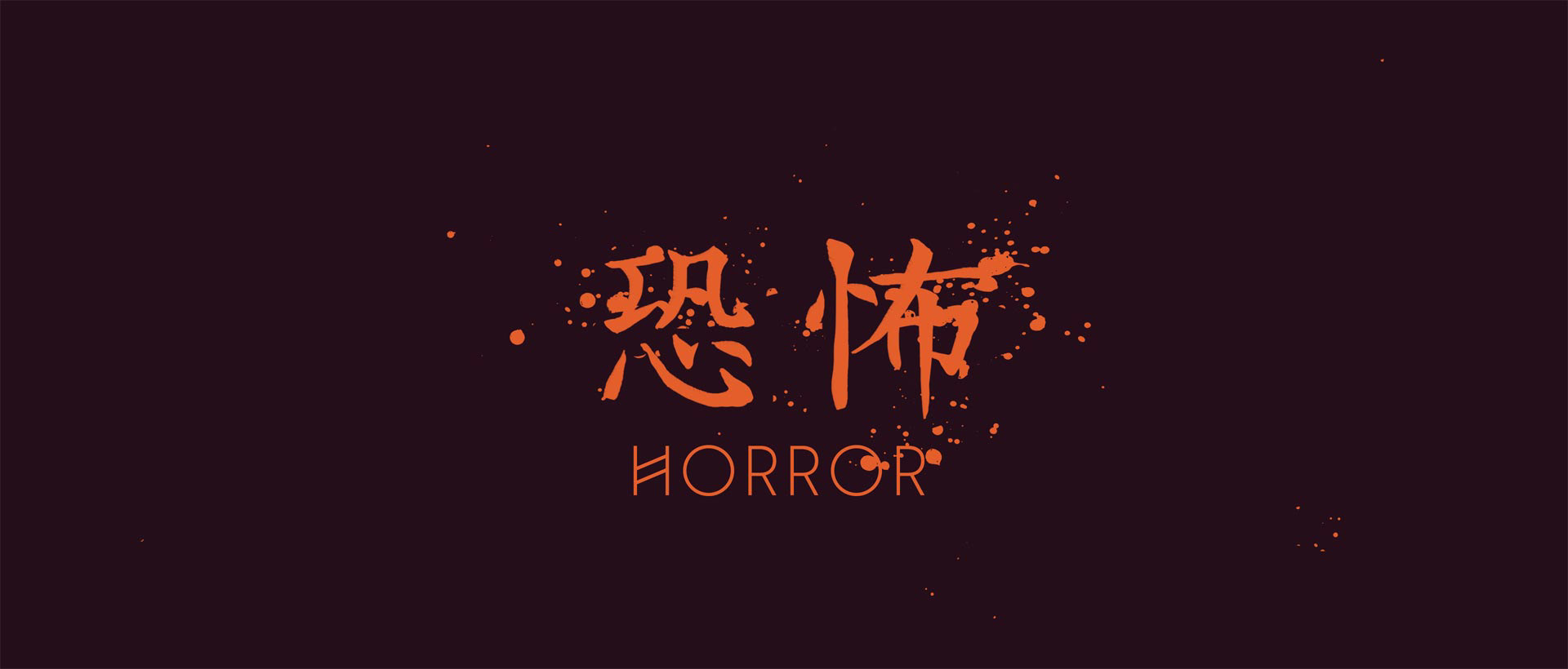
Various ideas for Asian languages and typefaces where experimented with, including Korean, Japanese and Chinese. In the end Chinese (Traditional when possible) was picked due to the setting of the story.
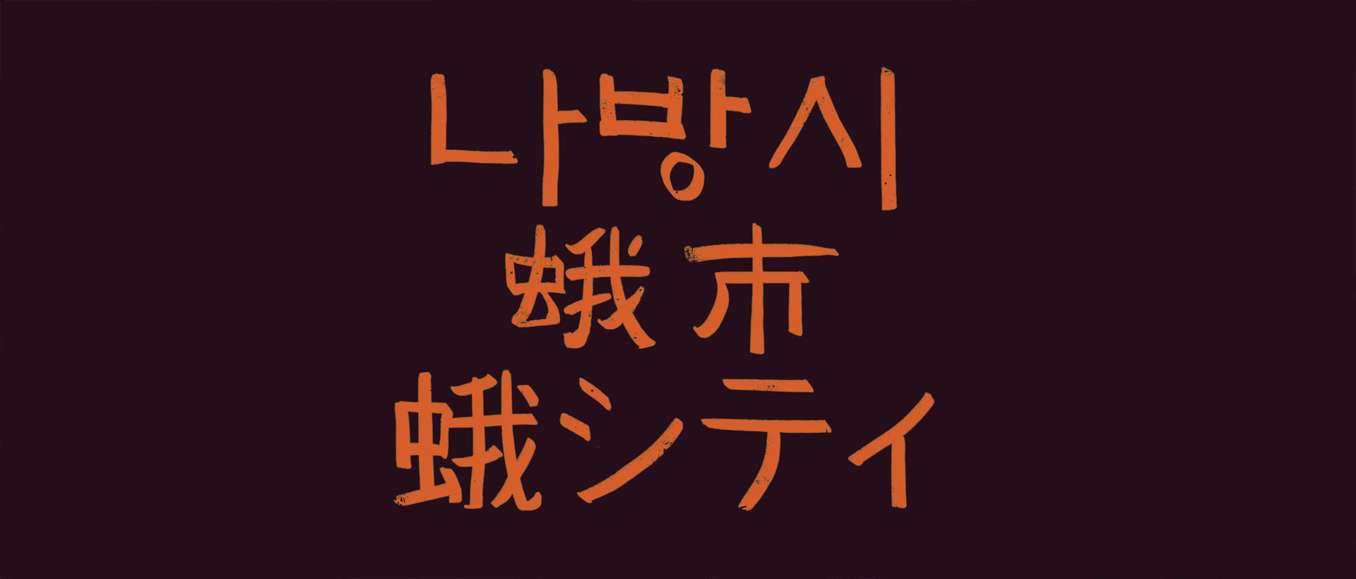
A test showing the combination of the fonts. The Chinese characters had to be drawn by hand due to a surprising lack of digital options.
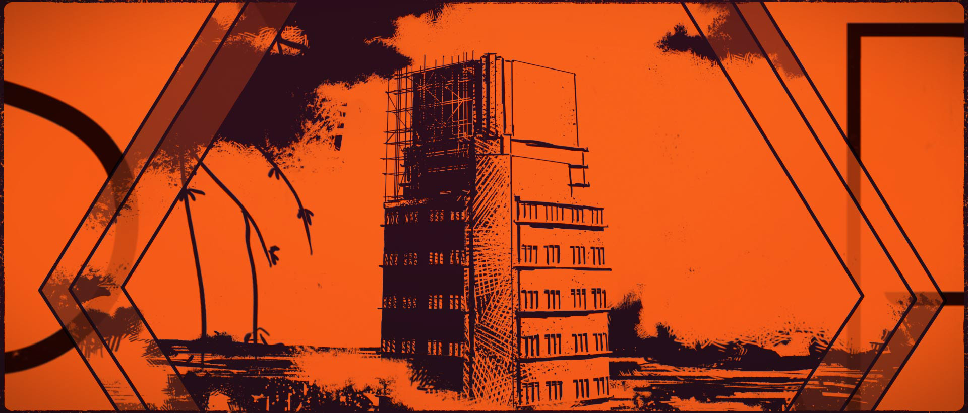
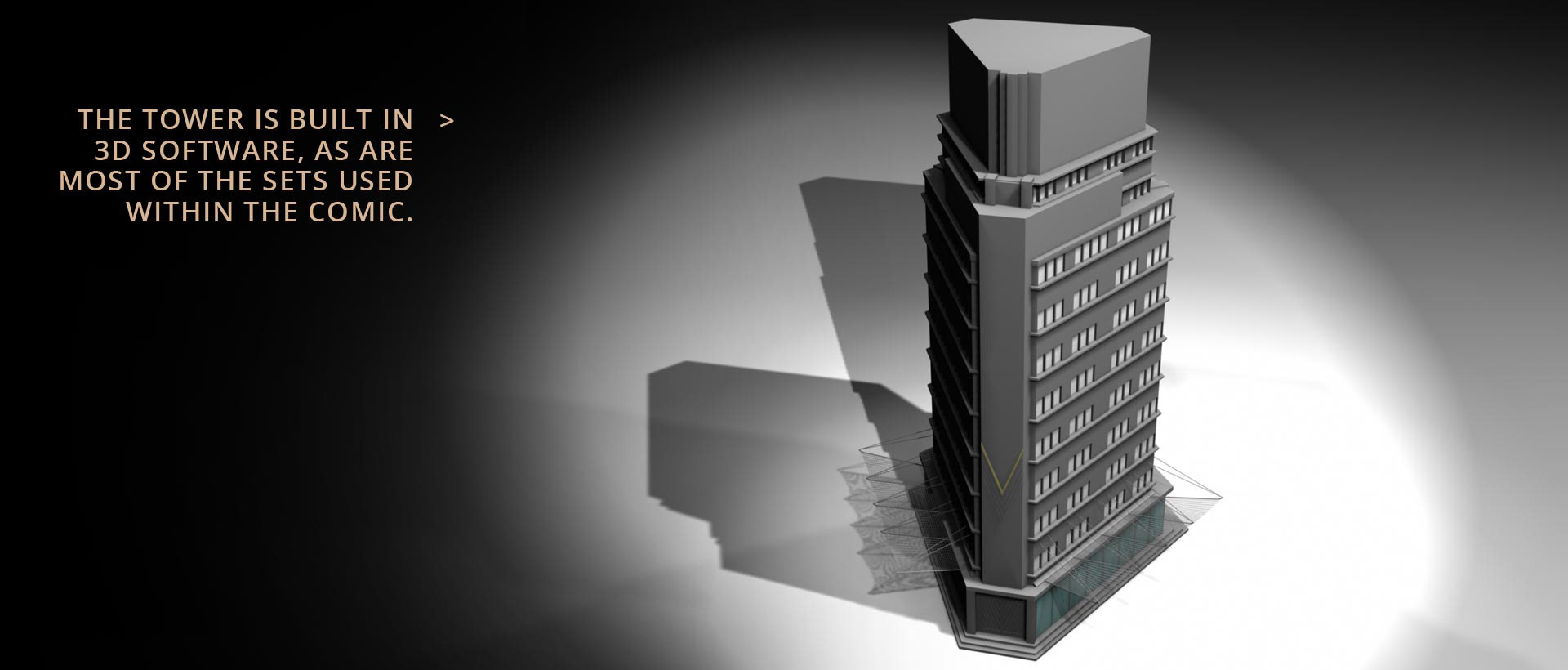
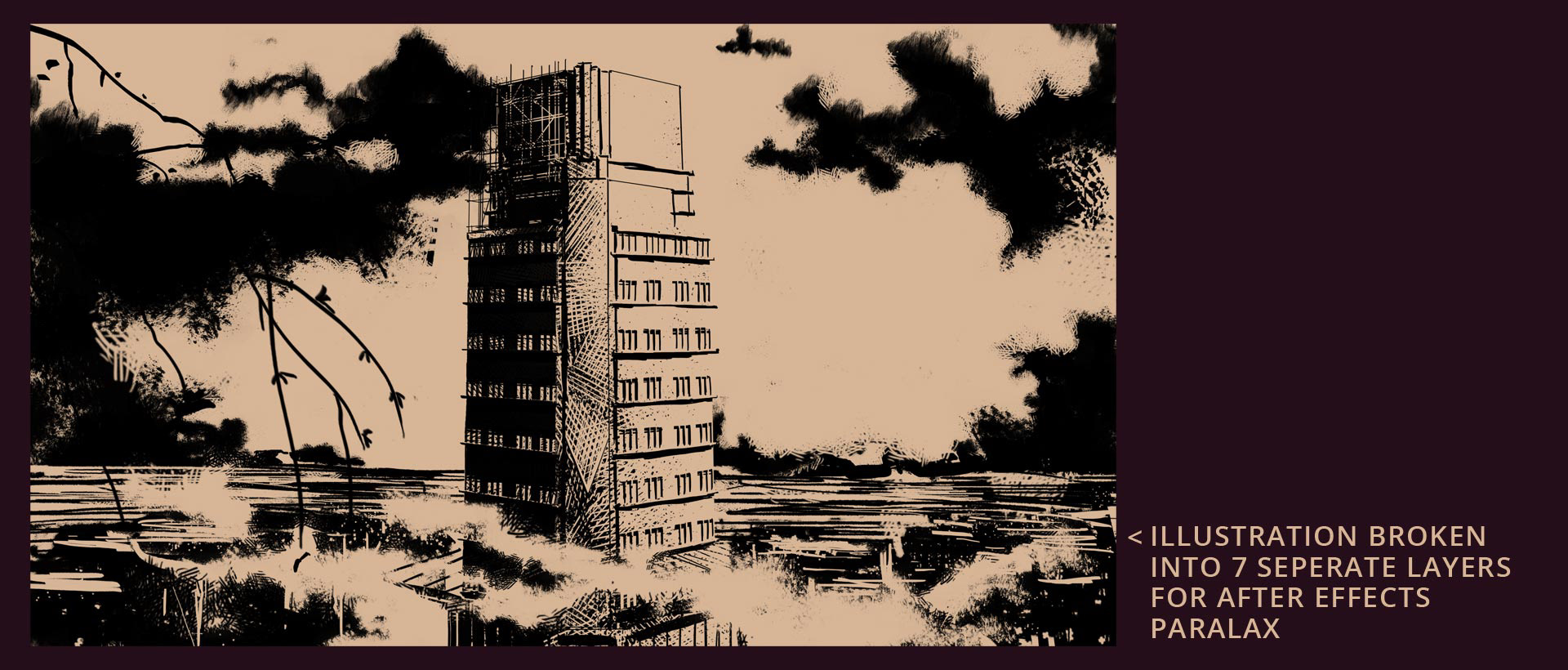
Both the Moth City comic and the trailer take advantage of 3D modeling software to assist with the illustration process.
Thanks for looking, I hope you like it. And if you wanna see more, make sure you check out our website - www.mothcity.com or pick up a free digital issue at Comixology.